Rebrand 2020: Investing in Ourselves
Investing in Ourselves: 2020 Rebrand
For 22 years, Phase 2 had focused on our clients first and refining our methodology for digital transformation. But, our solid foundation and accelerating growth revealed to leadership a need to refine our brand and position Phase 2 for the continued growth ahead. So, for our 22nd anniversary, we redesigned our brand to be fresher, more flexible, and reflect our growing future for many years to come.
Visual System & Design: Amanda Dely
Creative Direction & Design: JoJo Franklin
Messaging, Marketing, & Design: Lesley Clark
Business Direction: Heath Clinton & Kris Kettner
Our Story
Founded in 1998 and headquartered in Oklahoma City, Phase 2 has evolved from developing websites into one of the premier software development firms in the United States. We are a driven group of passionate, creative professionals who never settle for good enough.
Above all, Phase 2’s mission is to improve people’s lives through technology. We solve the most complex problems, thrive on the intricacies of software development, and leverage digital transformation for every client’s future success.
Our Brand
Whatever software methodology, the phrase “Phase 2” generally represents advancing from one stage of a project to another. Through digital transformation, we aim to ensure quality at every stage of a product’s life and take our client’s technology objectives to the next level.
As our organization has grown, so has the need to further evolve our visual styles, presentation methods, and position Phase 2 as an industry thought leader. There were a few requests for the new Phase 2 brand: visually simple (no illustrations) yet show we are equipped for complex, show a gradual evolution from existing assets, and be concise in messaging.
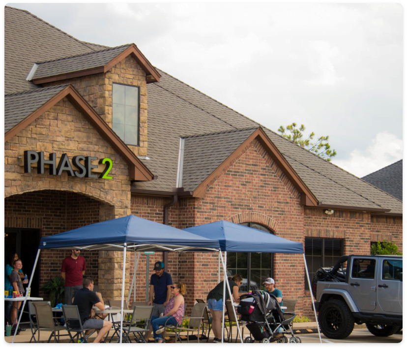
P2 Brand: 2008 – 2019
The previous Phase 2 brand embodied who our company was at the time. Until 2012, Phase 2 offered both software development and full-service website design. When our leadership realized complex custom software was our bread and butter, we sold the website portion. However, our brand look and feel remained the same.
The more our talent in software engineering grew, the less our brand fit with who Phase 2 was becoming – an elite software firm serving enterprise-level clients.
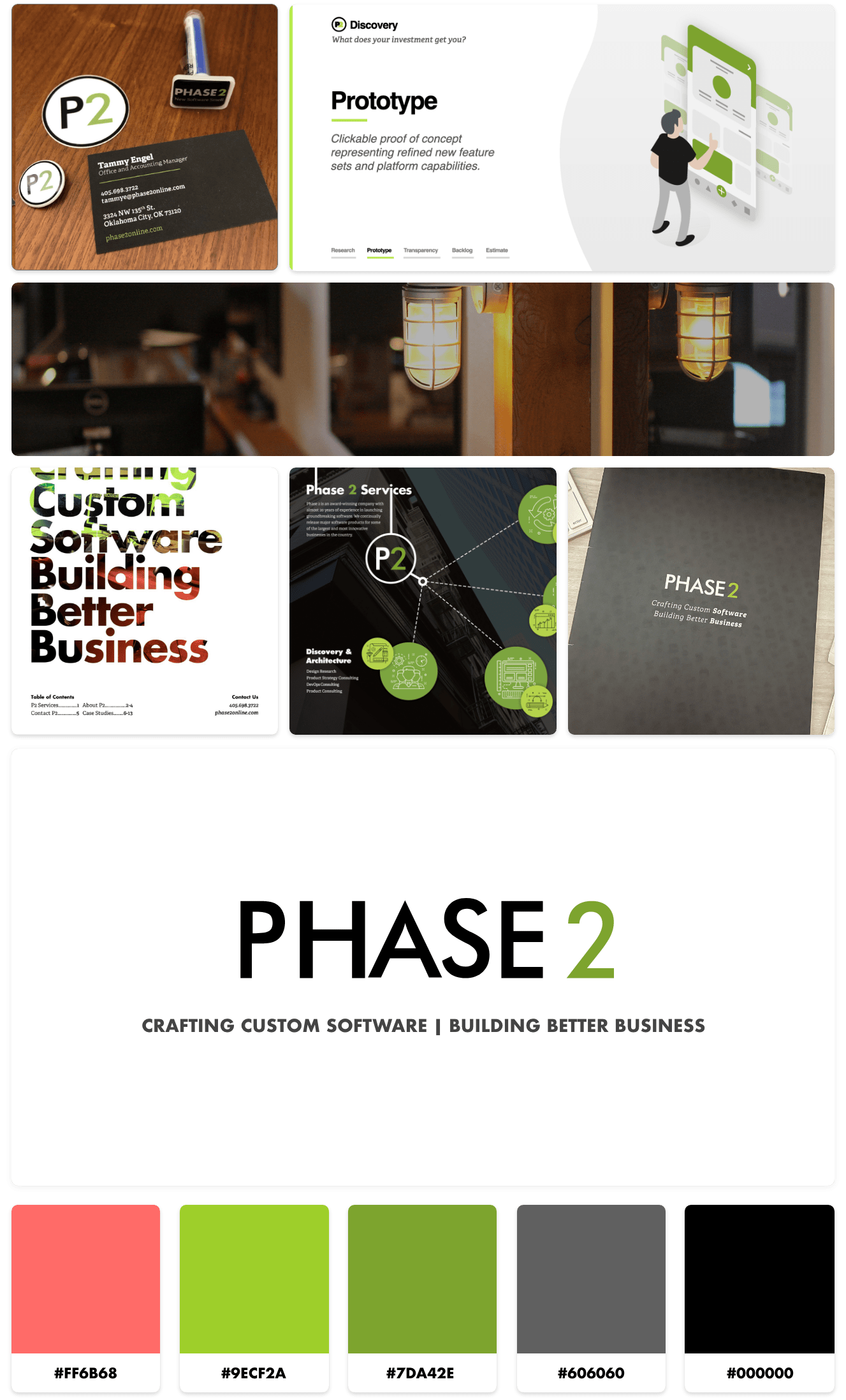
2020 Rebrand Process
Success Metrics
The first step in our rebrand process was to define what the metrics for success would be. There were three general areas we could divide these goals into: business, marketing and design. Next, we identified what the brand needed to deliver for each area. These goals could be summed up into three words: clear, consistent, efficient.
Business
Marketing
Design
Position P2 as a tech leader
& top enterprise partner.
Concisely communicate
services & expertise.
Streamline lead generation
& talent acquisition.
Keep a consistent style
across all platforms.
Showcase commitment to
culture, transparency, & values.
Highlight P2’s elite experience
& unique perspective.
The visual system must be
flexible & scalable.
Show a gradual evolution
of P2’s current look & feel.
Deliver relevant brand
touch-points & standards.
CLEAR
CONSISTENT
EFFICIENT
Brand Pillars
The next step of the rebrand was to identify four words that truly described our organization’s DNA – these are our Brand Pillars. These four pillars encompass who Phase 2 is, and how we want our current and prospective clients and employees to see us. This foundation set the tone for both visual and written parts of the new brand.
Authentic
As our stabilizing force, our culture and experience lead us to be unapologetically ourselves. We know the kind of work we like to do and the types of clients we like to do it with. We care about our products and how we collaborate to accomplish them.
Transparent
Our clients work with us because we are transparent in our processes, our communication, and our products. Our honesty grows long-lasting client relationships and the way we work alongside them proves we are a reliable, trustworthy partner.
Established
We see the challenges our clients face as our greatest competition and our deep bench of experience as our biggest advantage. We are constantly challenging our abilities to create clarity, find fresh solutions to fit our clients’ businesses, as well as make the most of their investment.
Tailored
Every business decision for the last 22 years has pushed us forward in our goal of improving the lives of surrounding businesses and their communities. We are dedicated to curating the right solution for our clients – existing or not – and designing it the right way.
Logo
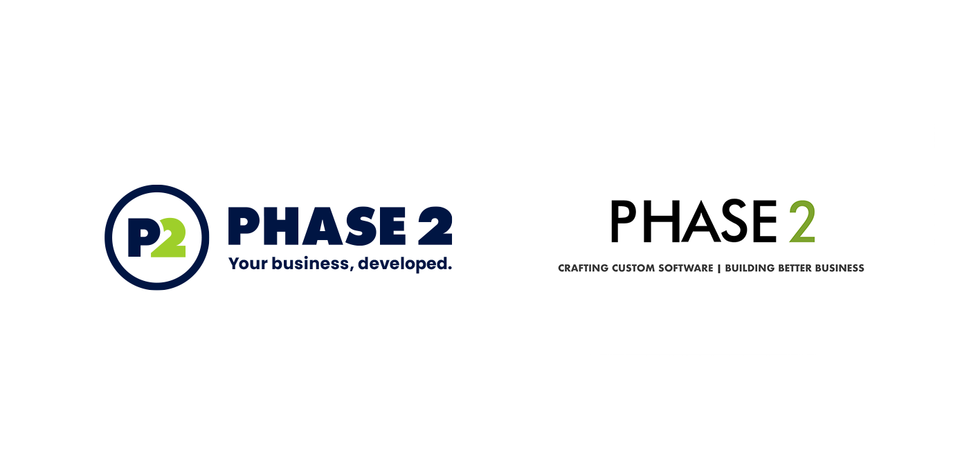
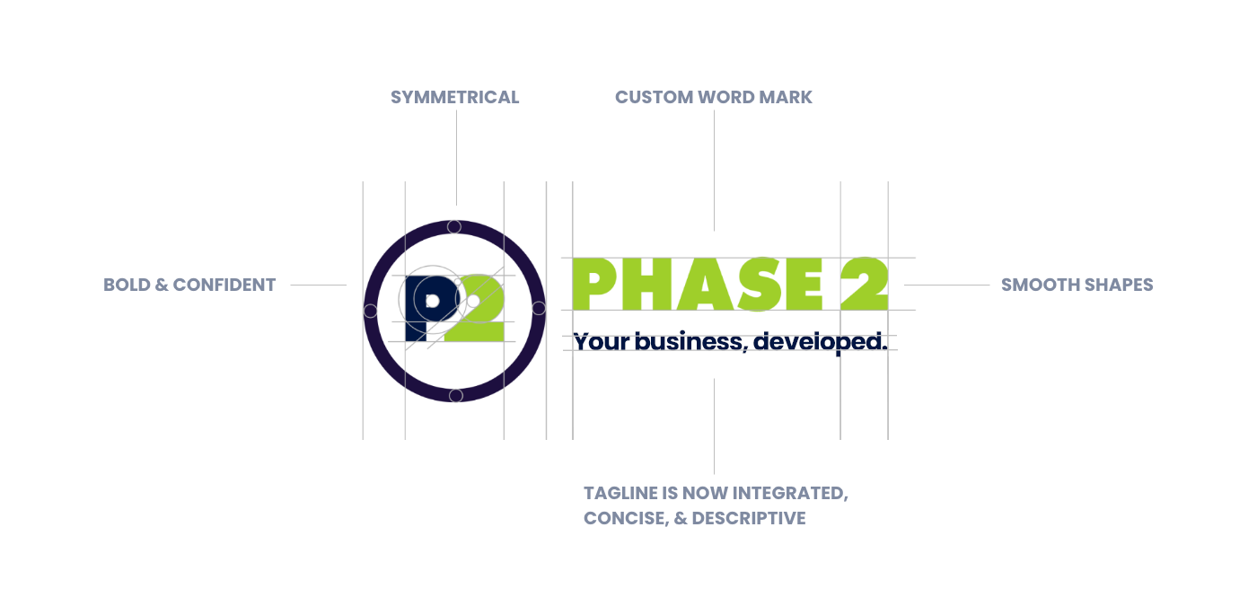
The original Phase 2 logo was almost too simple; it didn’t pack a punch. Additionally, it was disjointed as we had two different marks to accompany it and were used without rules or guidelines. The sharp points and thin lines did not lend to all forms of collateral on which we would try to reproduce the logo.
As part of the rebrand, the new logo incorporates a mark that can be used separately, yet still cohesive with the logo as a whole. The typeface has been customized to include smoother edges and shapes, as well as given thicker weight for bold confidence. This new logo can be a statement on its own or with the pieces separated depending on the collateral.
Typography
Old Type

A classic geometric sans-serif combined with an editorial slab-serif—both suited for web design.
New Type
Poppins Family
A modern geometric sans-serif with a personable flair that looks great with any media at any size or weight.
Colors
In honor of Phase 2 history and our sincerest thanks for the company and culture they created, we decided to name our color palette after our Leadership Team in the rebrand. They are the backbone of our business and help keep our lives running smoothly, both our work lives and home lives, so we can continue to impress our clients and grow our skills.
Primary
Secondary
Accent

TOWLER
#001543
FRANKIN
#9ECF2A
KEMPTON
#00A3B3
CLINTON
#0053B5
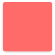
ENGEL
#FF6B68

KETTNER
#9ECF2A / #00A3B3
Visual Concept
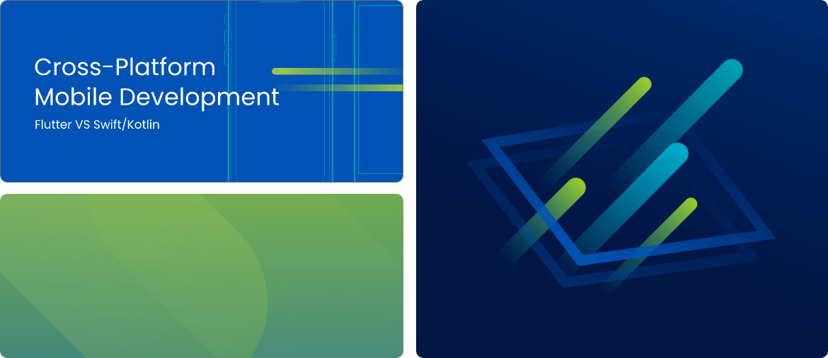
The Code Synthesis concept represents the blend of complex processes underlying custom software. Single lines of “code” come together to create an abstract foundation. Like Phase 2, they interact, collaborate, merge, and expand with different shapes, and each other, to create tailored and meaningful compositions.
Our “code” motif was inspired by the movement and forward momentum of digital transformation, and the visual arrangement of software. As code is the structure for our products, our motif formed a solid visual foundation from which all elements and shapes could be derived.
Code lines can serve as a single motif to bring attention to an element, or appear in a group to form visual interest. They can be cropped and enlarged for background textures or atmospheric effects, or create hero illustrations.
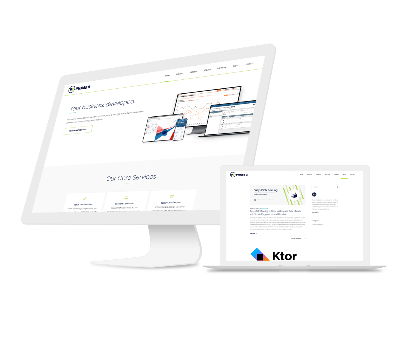
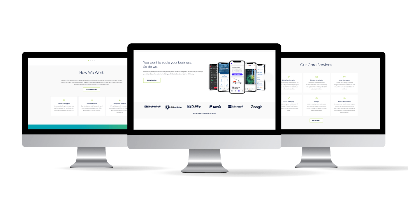
Website: Home & Blog
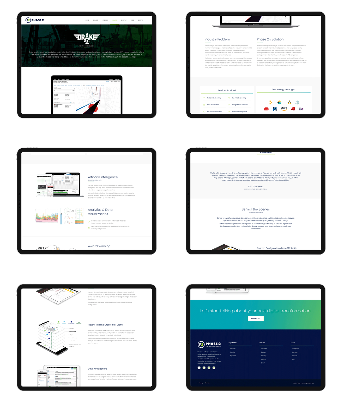
Case Studies
Home Page
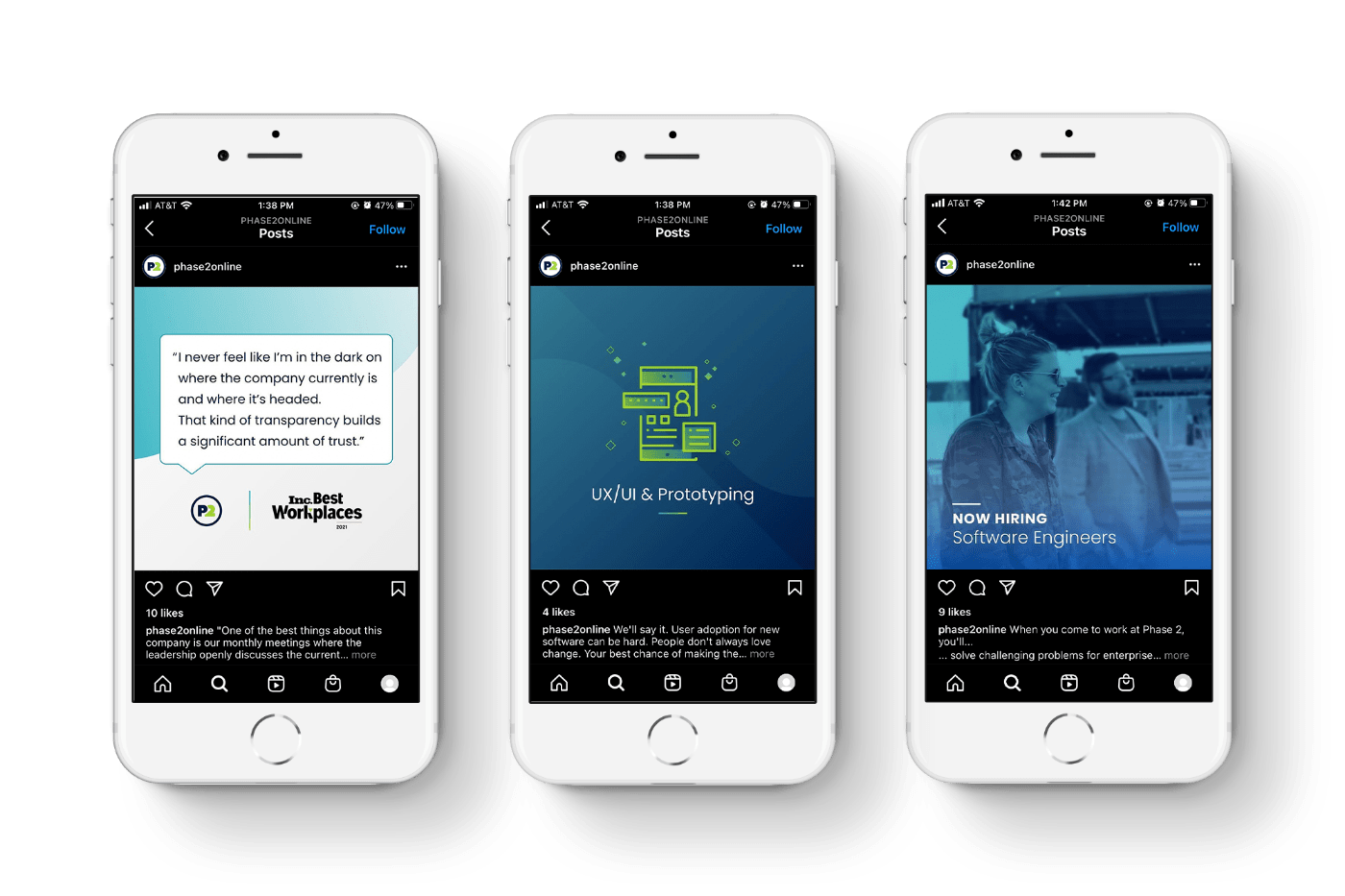
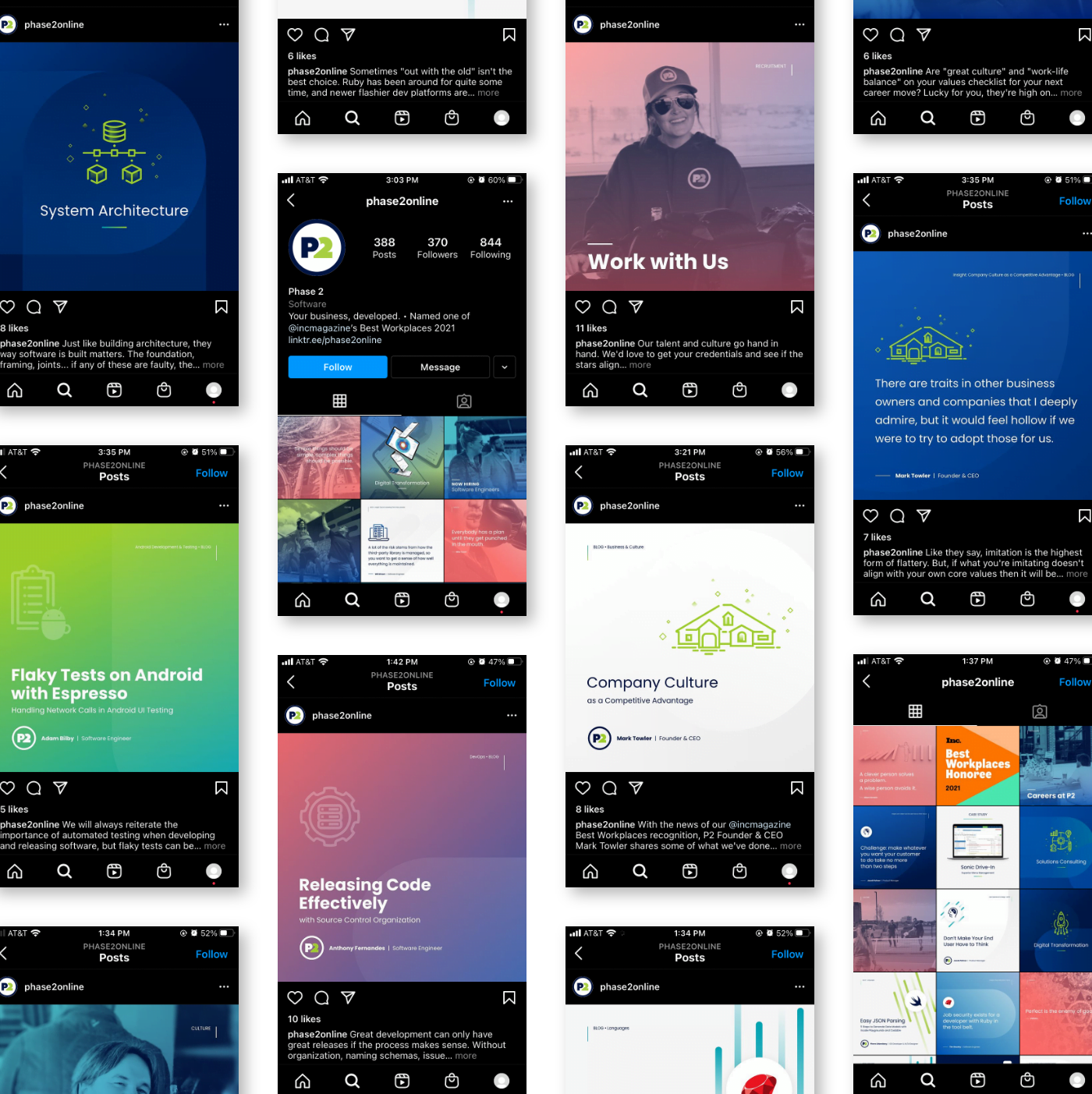
Social Media: Instagram
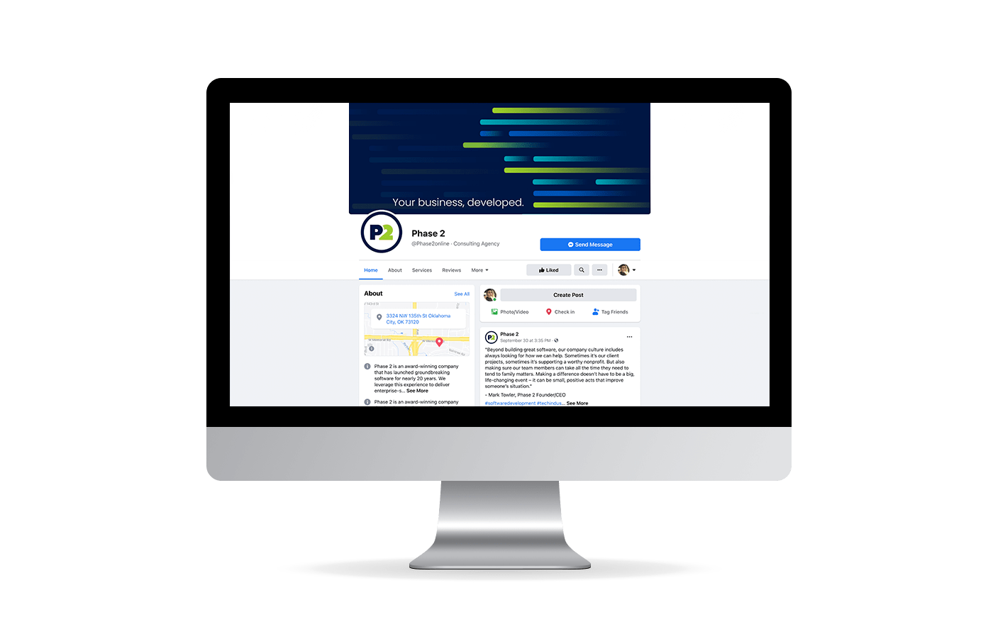
Social Media: Facebook
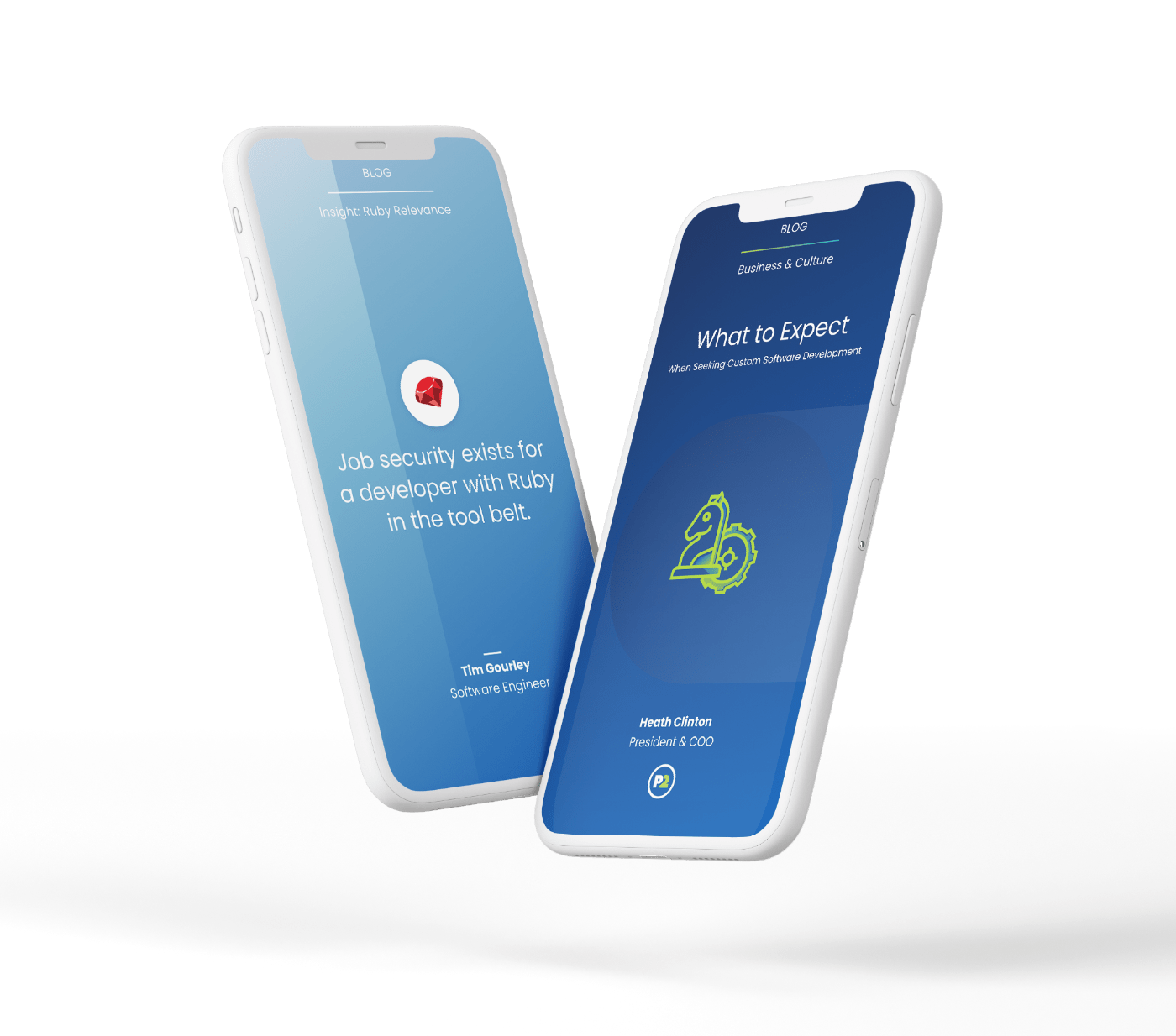
Blogs
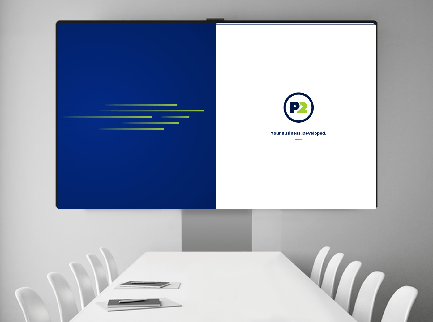
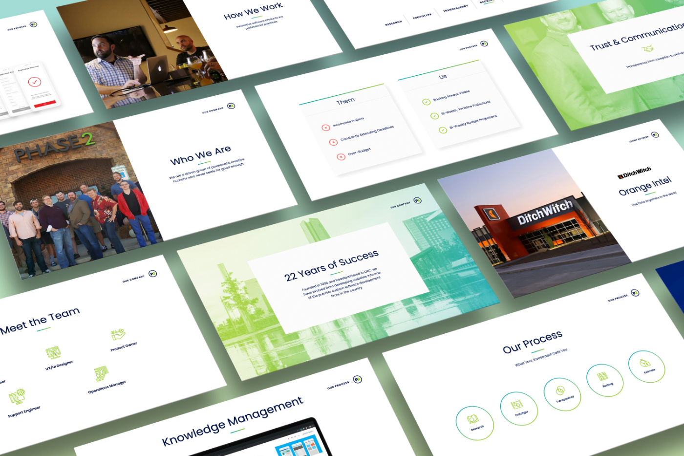
Presentation Deck
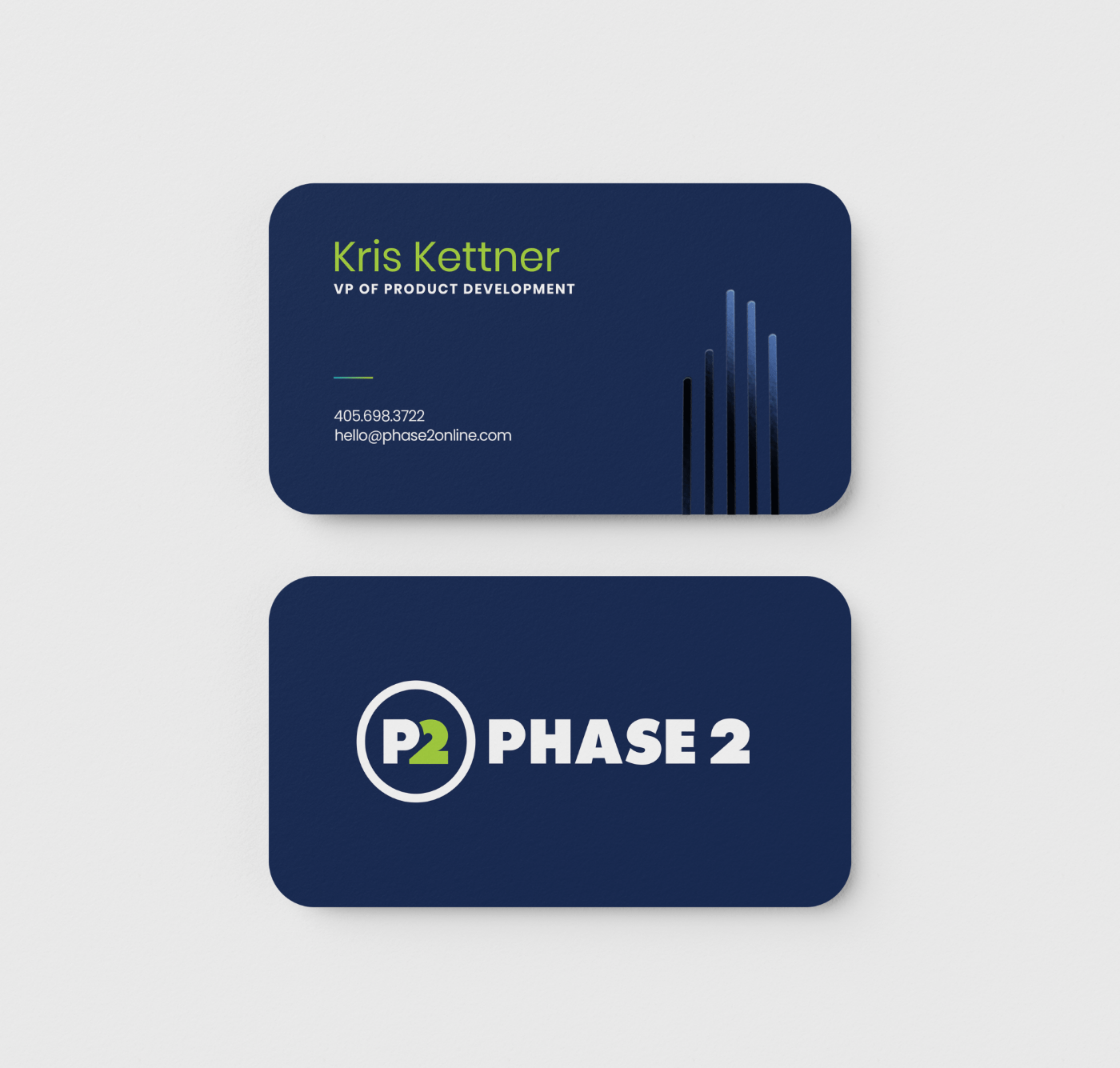
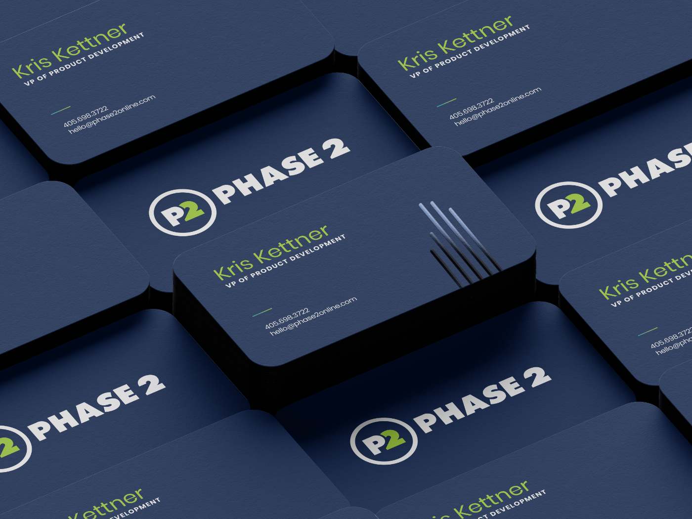
Business Cards
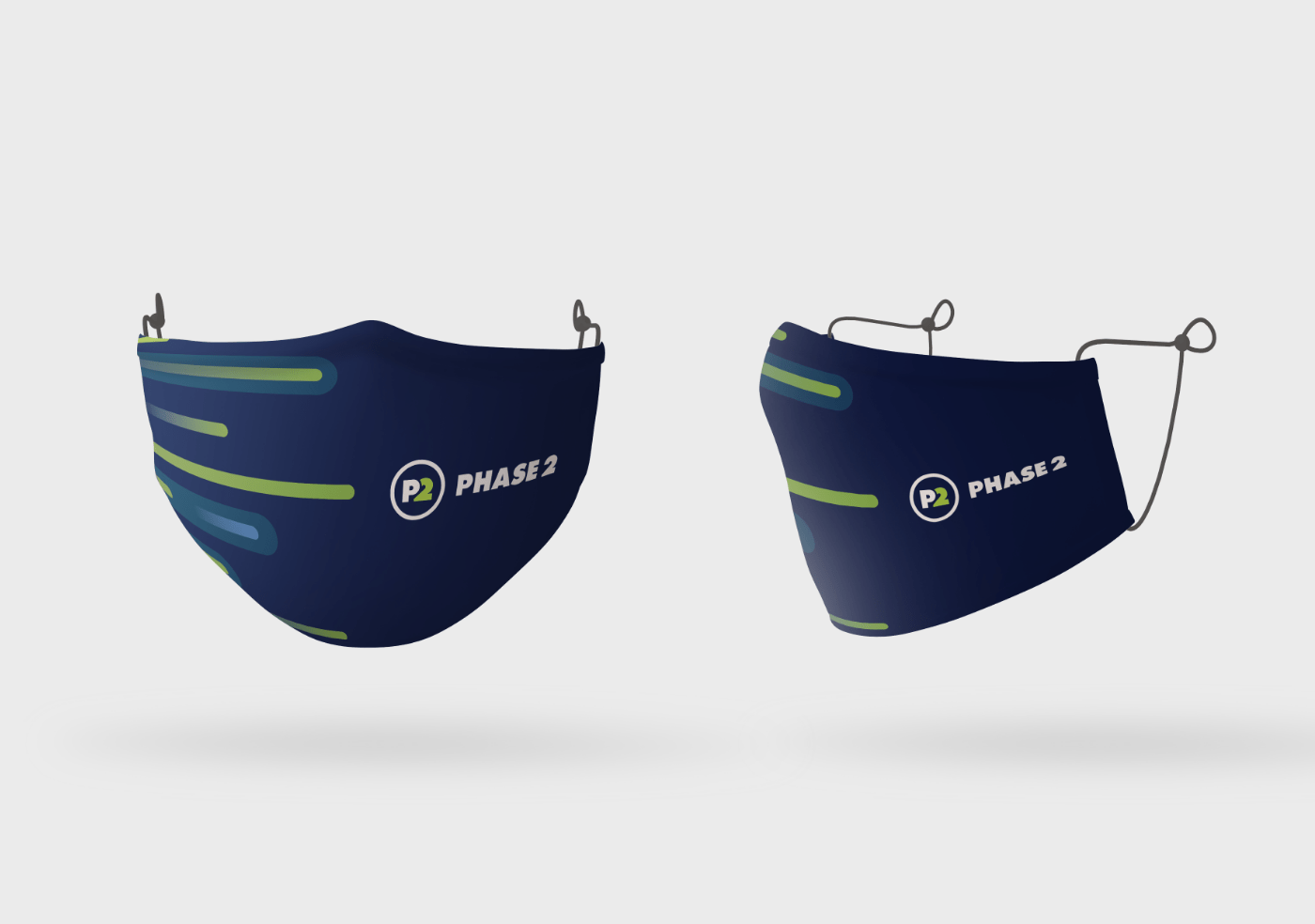
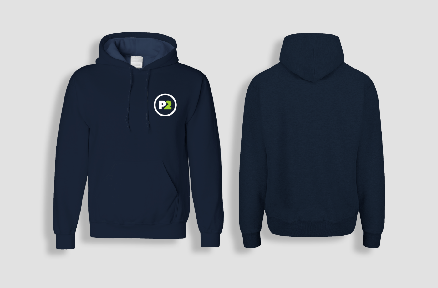
Wearables
